
Halves · Sign-in theme
Halves
A split screen without any HTML: the form sits on white in the left half, the right half is your color with rings and a dot grid. CSS only, so organization admins can install it.
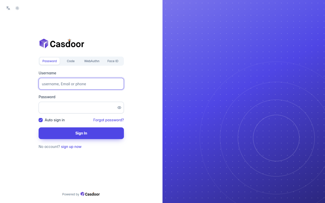
What it sets
| Theme | default |
|---|---|
| Border radius | 10px |
| Form position | Center |
| Custom CSS | Yes |
| Custom CSS Mobile | Yes |
Everything is on the application's UI Customization tab in Casdoor, so you can keep adjusting it after applying the theme.
Apply it to an application
- Enter the application below, adjust the theme's settings, and copy the JSON.
- In the Casdoor console, open Applications, edit that application, click Import JSON at the top, paste the JSON and click OK.
- Click Save. The sign-in page uses the theme from the next visit.
{
  "name": "<application name>",
  "organization": "<organization>",
  "themeData": {
    "themeType": "default",
    "colorPrimary": "#4f46e5",
    "borderRadius": 10,
    "isCompact": false,
    "isEnabled": true
  },
  "formOffset": 2,
  "formCss": "<style>\n.login-background {\n  color-scheme: light;\n  --background: 0 0% 100%;\n  --foreground: 222 47% 11%;\n  --card: 0 0% 100%;\n  --card-foreground: 222 47% 11%;\n  --popover: 0 0% 100%;\n  --popover-foreground: 222 47% 11%;\n  --muted: 210 40% 96%;\n  --muted-foreground: 215 16% 47%;\n  --accent: 210 40% 96%;\n  --accent-foreground: 222 47% 11%;\n  --border: 214 32% 91%;\n  --input: 214 32% 85%;\n  font-family: Inter, ui-sans-serif, system-ui, -apple-system, 'Segoe UI', sans-serif;\n  background: #ffffff;\n}\n.login-background > div:first-of-type,\n.login-content,\n#footer {\n  position: relative;\n  z-index: 1;\n}\n.login-background::before {\n  content: '';\n  position: fixed;\n  top: 0;\n  right: 0;\n  bottom: 0;\n  width: 50%;\n  background: radial-gradient(circle at 70% 68%, transparent 0 90px, rgba(255, 255, 255, 0.16) 90px 92px, transparent 92px 150px, rgba(255, 255, 255, 0.12) 150px 152px, transparent 152px 220px, rgba(255, 255, 255, 0.08) 220px 222px, transparent 222px 300px, rgba(255, 255, 255, 0.05) 300px 302px, transparent 302px), radial-gradient(rgba(255, 255, 255, 0.22) 1.5px, transparent 1.6px) 0 0 / 24px 24px, linear-gradient(150deg, color-mix(in srgb, #4f46e5 75%, #ffffff) 0%, #4f46e5 45%, color-mix(in srgb, #4f46e5 55%, #000000) 100%);\n}\n.login-background > div:first-of-type {\n  width: 50%;\n  justify-content: flex-start;\n}\n.login-content {\n  justify-content: flex-start !important;\n}\n.login-content > div {\n  max-width: 400px;\n  margin-left: max(0px, calc(25vw - 216px));\n}\n#footer {\n  width: 50%;\n}\n.login-panel {\n  border: none;\n  border-radius: 0;\n  background: transparent;\n  box-shadow: none;\n}\n.login-logo-box {\n  justify-content: flex-start;\n  margin-bottom: 32px;\n}\n.signin-methods > div {\n  background: #f1f5f9;\n}\n.signin-methods [role='tab'][data-state='active'] {\n  color: #4f46e5;\n}\n.login-form label {\n  color: #334155;\n  font-weight: 500;\n}\n.login-form input:not([type='checkbox']):not([type='radio']) {\n  height: 46px;\n  border: 1px solid #cbd5e1;\n  border-radius: 10px;\n  background: #ffffff;\n  box-shadow: 0 1px 2px rgba(15, 23, 42, 0.05);\n}\n.login-form input:not([type='checkbox']):not([type='radio']):focus {\n  border-color: #4f46e5;\n  box-shadow: 0 0 0 4px color-mix(in srgb, #4f46e5 18%, transparent);\n}\n.login-form [role='checkbox'][data-state='checked'] {\n  background: #4f46e5;\n  border-color: #4f46e5;\n  color: #ffffff;\n}\n.login-form a {\n  color: #4f46e5;\n  font-weight: 500;\n}\n.login-form .login-button {\n  height: 46px;\n  border-radius: 10px;\n  background: #4f46e5;\n  color: #ffffff;\n  font-weight: 600;\n  box-shadow: 0 8px 20px -8px color-mix(in srgb, #4f46e5 70%, transparent);\n}\n.login-form .login-button:hover {\n  background: color-mix(in srgb, #4f46e5 88%, #000000);\n}\n.login-form .login-signup-link {\n  justify-content: flex-start;\n}\n.login-form .login-forget-password {\n  width: 100%;\n}\n</style>",
  "formCssMobile": "<style>\n.login-background {\n  color-scheme: light;\n  --background: 0 0% 100%;\n  --foreground: 222 47% 11%;\n  --card: 0 0% 100%;\n  --card-foreground: 222 47% 11%;\n  --popover: 0 0% 100%;\n  --popover-foreground: 222 47% 11%;\n  --muted: 210 40% 96%;\n  --muted-foreground: 215 16% 47%;\n  --accent: 210 40% 96%;\n  --accent-foreground: 222 47% 11%;\n  --border: 214 32% 91%;\n  --input: 214 32% 85%;\n  font-family: Inter, ui-sans-serif, system-ui, -apple-system, 'Segoe UI', sans-serif;\n  background: #ffffff;\n}\n.login-background > div:first-of-type,\n.login-content,\n#footer {\n  position: relative;\n  z-index: 1;\n}\n.login-background::before {\n  content: '';\n  position: absolute;\n  top: 0;\n  left: 0;\n  right: 0;\n  height: 132px;\n  background: radial-gradient(circle at 70% 68%, transparent 0 90px, rgba(255, 255, 255, 0.16) 90px 92px, transparent 92px 150px, rgba(255, 255, 255, 0.12) 150px 152px, transparent 152px 220px, rgba(255, 255, 255, 0.08) 220px 222px, transparent 222px 300px, rgba(255, 255, 255, 0.05) 300px 302px, transparent 302px), radial-gradient(rgba(255, 255, 255, 0.22) 1.5px, transparent 1.6px) 0 0 / 24px 24px, linear-gradient(150deg, color-mix(in srgb, #4f46e5 75%, #ffffff) 0%, #4f46e5 45%, color-mix(in srgb, #4f46e5 55%, #000000) 100%);\n}\n.login-background > div:first-of-type button {\n  color: #ffffff;\n}\n.login-content {\n  padding-top: 40px;\n}\n.login-logo-box {\n  margin-bottom: 36px;\n}\n.login-logo-box img {\n  padding: 10px 14px;\n  border-radius: 12px;\n  background: #ffffff;\n  box-shadow: 0 8px 24px -8px rgba(15, 23, 42, 0.35);\n}\n.login-panel {\n  border: none;\n  border-radius: 0;\n  background: transparent;\n  box-shadow: none;\n}\n.login-logo-box {\n  justify-content: flex-start;\n  margin-bottom: 32px;\n}\n.signin-methods > div {\n  background: #f1f5f9;\n}\n.signin-methods [role='tab'][data-state='active'] {\n  color: #4f46e5;\n}\n.login-form label {\n  color: #334155;\n  font-weight: 500;\n}\n.login-form input:not([type='checkbox']):not([type='radio']) {\n  height: 46px;\n  border: 1px solid #cbd5e1;\n  border-radius: 10px;\n  background: #ffffff;\n  box-shadow: 0 1px 2px rgba(15, 23, 42, 0.05);\n}\n.login-form input:not([type='checkbox']):not([type='radio']):focus {\n  border-color: #4f46e5;\n  box-shadow: 0 0 0 4px color-mix(in srgb, #4f46e5 18%, transparent);\n}\n.login-form [role='checkbox'][data-state='checked'] {\n  background: #4f46e5;\n  border-color: #4f46e5;\n  color: #ffffff;\n}\n.login-form a {\n  color: #4f46e5;\n  font-weight: 500;\n}\n.login-form .login-button {\n  height: 46px;\n  border-radius: 10px;\n  background: #4f46e5;\n  color: #ffffff;\n  font-weight: 600;\n  box-shadow: 0 8px 20px -8px color-mix(in srgb, #4f46e5 70%, transparent);\n}\n.login-form .login-button:hover {\n  background: color-mix(in srgb, #4f46e5 88%, #000000);\n}\n.login-form .login-signup-link {\n  justify-content: flex-start;\n}\n.login-form .login-forget-password {\n  width: 100%;\n}\n</style>"
}More sign-in themes
View all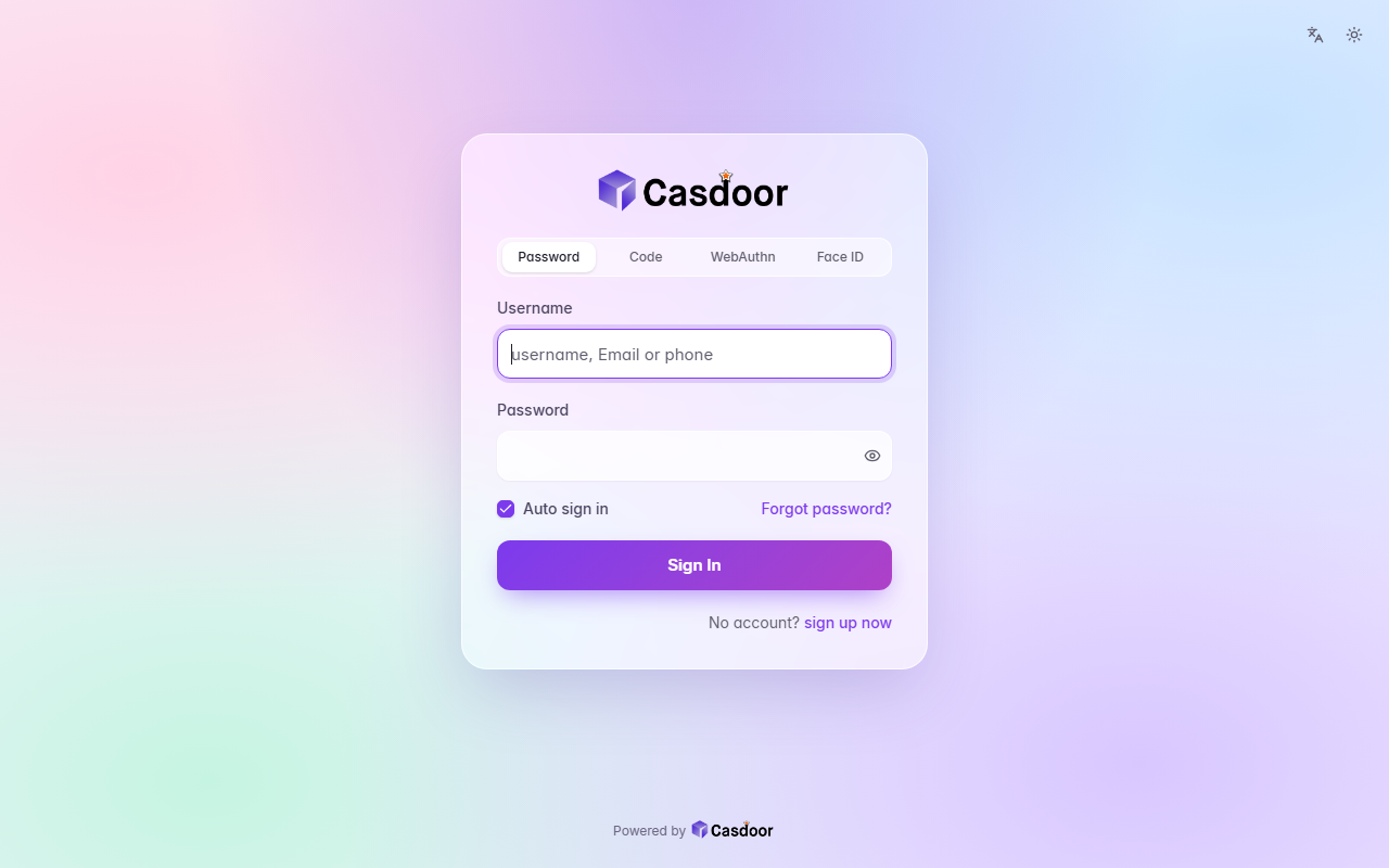
Aurora
Sign-in themeA pastel mesh of color tinted by your accent behind a frosted glass card, with soft rounded fields and a gradient button. CSS only, so organization admins can install it.
Backdrop
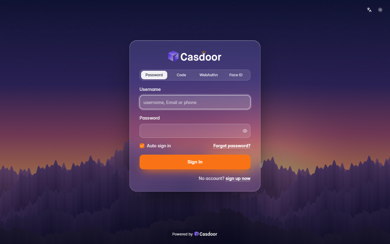
Sign-in themeYour own picture behind the whole page, dimmed a little, with a frosted glass card on top. It comes with a dusk mountain scene; give it any image address to use yours. Organization admins can install it.
Bare
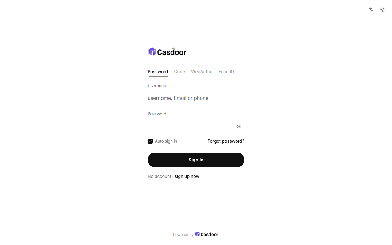
Sign-in themeNothing but the form: no card, no background, a small left-aligned logo, quiet text tabs, hairline fields and a round button, with plenty of white space. CSS only, so organization admins can install it.